A virtual three dimensional world has been created in this opener for the 2010 European Video Music Awards for MTV. The motion-graphic clip begins with a dramatic example of linear perspective as we see a ball about to blast through a tunnel. This chiaroscuro-based shot sets the scene in a poignant and dramatic way for what is to come. In the following seconds, overlap, relative size and height, and more linear perspective are introduced as the balls begin their journey. Color and reflectivity are used on the virtual surface of the race track, accentuating the forms as they blast through space. Flow pattern, which blurs the outside space around the moving element of the ball, while keeping it's destination in focus, is also used beautifully here, taking us right into the action as if we are the ball racing along on the track. Finally, in the crowd shots, texture gradient and atmospheric perspective are used along with sound perspective (crowd noise presented realistically to that of a giant arena) to further create this convincing and exciting illusion of depth and dimension on a grand scale in this motion-graphic piece. Had these various graphic depth factors not been considered, this clip would not be as strong as it is.
Tone is providing dimension to this piece by expressing, through light, the contours of all the squirming shapes of color in this clip. A wide tonal range is presented from darkest blacks to vivid whites.
Also, though the background is devoid of depth cues, a slight gradient from white to gray is presentedwhich expresses light. This gray-scaleis also an example of tone.
HOW TONE IS INTERACTING
Tone is interacting with the visual element of dimension and texture here a great deal. The spindrils of color that move across the screen are seen as three dimensional forms, in which the summation of them create a visceral texture. Looking at the forms and there shape, presented by tone, one gets the idea of how this 'object' would physically feel.
This same idea could have been presented in a more flat 2-D way, i think, but by emphasizing tone to the extent that it provides dimensional shape, a more arresting life-like effect is accomplished.
HOW COLOR IS OPERATING
Color is the most dramatic, emotional element and this characteristic lends itself well to this arresting piece. The story presented of color being birthed from an egg-like structure into a wild frenzy is an exciting one. If the story were presented in gray scale, the tonal aspect would prevail, but the magical/emotional impact of the color spectrum would be lost. Furthermore, the colorful 'O' is given more power by being juxtaposed by the other gray colors.
HOW COLOR IS INTERACTING
Color is interacting with the element of motion here. It is thought that color vision was developed for survival in organisms in that it makes an approaching threat more easily recognizable. Movement is useful in considering the experience of the viewer, and as this short is basically a story about color, the movement given to the color threads combines with the color itself to create intense drama. Our eyes follow the movements of these colorforms that have been composed by the motion-graphic artist.
Movement is the most dominant visual element in Motion Graphics as well as the human experience. By giving movement to graphics, a real-life like sensibility is created that can have a strong effect on delivering a message to a viewer. By using moving objects and words to tell a story or communicate an idea, a much deeper effect can be achieved than that of a static image. Movement is achieved in Motion Graphics through programs like Adobe After Effects or Apple Motion which utilize a timeline on which the designer plots and composes each element's action. Motion Graphics create stories, like the example above, which are composed of moving elements and text which guide the viewer along.
Here is an example of how movement is directed in the production of a motion graphic. In this case, the 'camera' movement is being plotted out:
(example of the planning of a "camera angle" in a software program during the production of a motion graphics piece)
Movement is used in consideration of the viewer. The way in which motion graphics designers compose their moving images ends up being the way their ideas are "read" and thus seen by our eye movements, which we've learned in class.
LINE
Process board for Title sequence to Charles de Lauzirika’s "Crave" (2012) by Raleigh Stewart
Lines express ideas. Besides the lines that end up composing the final piece in motion graphics, the ideation phase of planning a project, (as in other realms of design), begins with sketches of lines on a page (or screen). Dondis describes the line as "the essential tool for previsualization, that means for presenting... that which does not exist yet, except in the imagination." (Dondis 43) Nearly all end pieces of motion graphic work begin with simple line drawings referring to the ideas of the designers, as we can see in the above process board for a title sequence forCharles de Lauzirika’s "Crave" (2012).
We can also consider the line in regards to the timeline that all moving pieces contain: a starting point to an end point, as lines both literally and metaphorically are marks of progression.
The line is a huge factor in delivering a motion graphic's message, where like a flow-chart, our experience in viewing a piece is structurally guided in a progression from one idea to the next until the whole message is attained. Some times this is done explicitly by following an actual lines movement form say one piece of text to the next.
TONE
stills from "Crave" (2012) title sequence by Raleigh Stewart
Tone builds from line. Lines form the edges and borders of dark and light pattern areas. These dark and light areas exist as tone, which is the representation of the relative presence and absence of light. Without light our physical world would be in the dark and we would be unable to see our environment. The same circumstance has to be considered when creating the virtual worlds of motion graphics.
Tone is the basic visual element that allows us to see defined shapes and environments. "Line alone will not create the illusion of reality effectively without the aid of tone. The addition of tonal background detail reinforces the appearance of reality through the sensation of reflected light and cast shadows." (Dondis 48)
So it is vital that tone be used correctly, especially when a designers goal is to interpret a physical world. Motion Graphic designers need be aware of tone in their work, especially when they want to convey real-world like environments.
Work Cited: Dondis, D. A. (1973). A primer of visual literacy. (First ed.). Cambridge, Massachusetts: Massachusetts Institute of Technology.
My wife and I completed some visual thinking operations. Here is our work, along with explanations of why we did what we did...
For awhile I tried to think of all sorts of codes for translating these symbols to a month. I thought it was probably a month with few letters. Then I noticed that each symbol had a vertical symmetrical balance, and like with inversedrawing, I discovered the word 'JULY' by folding down the symbols mentally.
My wife saw how the symbols related to one and other, in that there is a whole circle with two halves followed by another whole-like symbol that could be seen as suggesting something by its shape. She guessed that the group may stand for June because it is the half-way point of the year. Good effort, and interesting strategy...
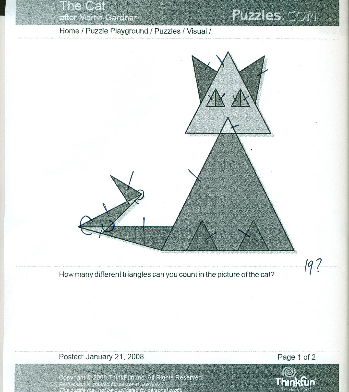
These final two puzzles involved us in the visual thinking operations of 'finding'. We were to count the total number of triangles. My wife's try is shown here with mine below. The answer is twenty. My wife counted nineteen...
I have to
admit that although my try shows twenty, neither of us counted all
twenty on the first few tries. For me my visual reasoning messed me up
when it came to the eyes. I counted the four seperate triangles but neglected to count the two larger triangles that composed each eye. I guess I was looking so much to find each triangle, I neglected to step back enough to see the completing going on which presented the two extra triangles. I counted 18 for the longest time...
We also both had trouble with the tail. This involved a bit of rotating and completing, because several triangles compose the tail, and to find them all, you need to really activate your visual reasoning.