Thursday, December 20, 2012

Visual Techniques


STILLS FROM "CATALOG"
JOHN WHITNEY, 1961

VIEW PIECE IN NEW WINDOW 


VISUAL TECHNIQUES USED:
ACTIVENESS OVER STASIS
COLOR OVER GRAYSCALE

(BACK AND FORTH BTW):
 SYMMETRY / ASYMMETRY
SEQUENTIALITY / RANDOMNESS
UNITY / FRAGMENTATION


"POSTER FOR AN EXHIBITION OF ART BY HENRY MILLER" 
TADANORI YOKOO, 1968


VISUAL TECHNIQUES USED:
CONTRAST / HARMONY
COLOR / BLACK AND WHITE
BALANCE / INSTABILITY
ECONOMY / INTRICACY
NEUTRALITY / ACCENT
SIMPLICITY / COMPLEXITY
ACTIVENESS / STASIS


     Above are two examples of Visual Communication that inspire me in my own pursuit of a career in design. Below I will compare and contrast the different uses of visual techniques both designers underwent in order to deliver their intended message.

     The most obvious contrasting element between the two is the use of activeness vs. stasis. The motion graphic piece by Whitney utilizes the elements of motion to bring his piece to life, while Yokoo's poster design is one stoic, unmoving image. Both techniques lend well to each composition; where Catalog is achieved by moving elements, Henry Miller is defined by balance and harmony brought forth by its compositional structure.  

     The content of Whitney's piece is structured along the horizontal axis of time. We see colorful shapes rotate, move, and mutate within the frame during the duration of the film. The effect achieved is of time itself; that the shape elements are given life as they move and change within the piece, creating a powerful effect that is heightened by the expressive use of color that Whitney utilized. 
     During the duration of the film, the changeable nature of several visual techniques are utilized. For example, the technique of simplicity vs. complexity exist on a continuum from very simple to very complex. There are moments in the film where this relationship is expressed as we see a simple circle transform into a complex amorphous shape.

     The Yokoo piece is not only static, but is essentially about stasis, as the designer chose to balance the composition in a nearly symmetrical way by placing the figure of Henry Miller dead center against a leveled backdrop of pure blocks of color. The choice of economy over intricacy here does well to further emphasize an idea of stillness, as our eyes are confronted with a very simple POP-art like image, devoid of extraneous detail, that Yokoo chose to create for the historic writer. Like the Whitney piece, an emotional reaction is achieved in Poster, however in this case it is from the opposite visual technique of a profound stasis over activity.


Tuesday, December 11, 2012

CONTRaST


Effective Use of Contrast


"Metamorphosis" by Joel Arias

First, there's a great contrast in tone going on here between the values of grey, white, and black. Although there is an almost harmonious balance of the amount of each tone, the shapes representing each do well to sharpen the composition. Dondis states that by "comparing the unlike, we sharpen the meaning of both," and this is definitely happening here between the regular rectangle shape and the irregular, liquid-like shapes drifting on top of and within the regular (Dondis, 1973). This contrast in shape creates a dynamic statement. There lies a pleasing tension in this piece between balance and imbalance represented through contrast. I think the liquid white and grey shapes would be powerful by themselves, but with the added element of the solid rectangle, the juxtaposition happening between leveling and sharpening makes them that much more meaningful; the organic ideas here are more effectively explained by being contrasted with the mechanical, and vice versa.

There are also other elements of contrast at work here. Scale is contrasted between tiny to large shapes, and texture is contrasted here in the stippled grey shapes against the solid black and whites.


Lack of Contrast


There is a use of contrast in tone and color here, but it is not being done in an effective way. Rather, it is contributing to a failed design. The piece is far too sharpened, beyond any effective communication of a message. Firstly, if one were to take and convert this image to gray-scale, some of the type would be completely lost (ex. the 'in' in 'sin'). The rainbow background is  presenting warm and cold colors, which are confusing our minds (as cool colors recede, while warm colors expand) creating a way too busy background. A solid color would have been a better choice, perhaps one complimentary to the color of the text, or even better, contrasting in tone. Contrast in scale could have helped this piece as well, where if the text was larger, it might stand a chance against the glaring color bands it unfortunately rests above.

I do have one idea that could save this piece without having to totally redesign it: The flying red letters presented at the top of the page are really the only element not lost in the bad juxtaposition between the colored figure and ground. If all the text was done as red with the dimensional 'flying' addition, it would thus all be separated enough from the crazy background. It would still be a jarring piece, but at least the written message would be visible.


reference:
Dondis, D. A. (1973). A primer of visual literacy. (p. 96). Cambridge, Massachusetts: The MIT Press.

Wednesday, December 5, 2012

IMPLIED MOTION IN DESIGN


(Both examples below can be found @ revisionarts.com)


 Joe Melhuish "Metamorphosis"


I look at this odd graphic and my immediate thought is to see it animated. I envision the webbed-matrix form circling the land spike both rotating and moving in a wavelike fashion, similar to water. This is because of its diagonal nature, which suggests stress rather than balance, and also the lighting effects mirroring water surface, and most importantly the optical effect created by the web-like pattern inside the shape tricks our eyes into seeing movement.

The cap of the land spike is being blasted-off. The blurring effect applied between the pieces of the spike suggest this action. Also, the designers decision to show a lot of textured gradient in the shadows of the dunes helps to create the illusion of an actual environment in which movement would be possible. All these factors contribute to the perception of an even taking place. Perhaps the story is that the web matrix created a causal effect on the land spike, blasting its top off into space so that the pyramids can fulfill their destiny in the stars...


MODE poster by Travis Stearns


"In the MODE experiment I wanted to synthesize the four letter forms, already in their abstraction,
with their revolved forms to generate new, ancillary graphic forms." -Travis Stearns


We see several factors of implied movement going on here in this poster piece. Over all, the highly contrasted forms create a downward directional path of eye movement. The static-y imagery of each form implies a sense of movement, as if each shape was on an old television set that wasn't coming in right. Also, as we see a morphing from actual letter-forms to abstract globs, we sense a process of change. It's as if each descending shape is a still image in a film roll; we can easily imagine watching the footage of this succession of stills, so media motion is addressed here as well. Through the combination of the strong vertical eye-path created, along with the repetition of the figures as they morph, a stroboscopic effect is created which makes us imagine all the steps of change happening between each neighboring form.

 A narrative is created by the metamorphosis of these letter forms, it is the story of abstraction. I included a bit of the designers statement of process because it describes that he captured these odd shapes by rotating the forms, perhaps in 3d modeling software; it seems the blur caused by such movement was maintained, creating something similar to an aftereffect of seeing a bright light in a dark room that suddenly goes away leaving a ghost image. All in all, this static image captures he energy of movement extremely well.


Thursday, November 29, 2012

DIMENSION/DEPTH/SPACE/SCALE


click below to watch:


A virtual three dimensional world has been created in this opener for the 2010 European Video Music Awards for MTV. The motion-graphic clip begins with a dramatic example of linear perspective as we see a ball about to blast through a tunnel. This chiaroscuro-based shot sets the scene in a poignant and dramatic way for what is to come. In the following seconds, overlap, relative size and height, and more linear perspective are introduced as the balls begin their journey. Color and reflectivity are used on the virtual surface of the race track, accentuating the forms as they blast through space. Flow pattern, which blurs the outside space around the moving element of the ball, while keeping it's destination in focus, is also used beautifully here, taking us right into the action as if we are the ball racing along on the track. Finally, in the crowd shots, texture gradient and atmospheric perspective are used along with sound perspective (crowd noise presented realistically to that of a giant arena) to further create this convincing and exciting illusion of depth and dimension on a grand scale in this motion-graphic piece. Had these various graphic depth factors not been considered, this clip would not be as strong as it is.

Thursday, November 15, 2012

TONE AND COLOR


STILLS FROM "COLR" by Emrah Gonulkirmaz
Motion Graphic Logo/Identity created for Colr Inc.


HOW TONE IS OPERATING
Tone is providing dimension to this piece by expressing, through light, the contours of all the squirming shapes of color in this clip. A wide tonal range is presented from darkest blacks to vivid whites.
Also, though the background is devoid of depth cues, a slight gradient from white to gray is presented which expresses light. This gray-scale is also an example of tone.
 

HOW TONE IS INTERACTING
Tone is interacting with the visual element of dimension and texture here a great deal. The spindrils of color that move across the screen are seen as three dimensional forms, in which the summation of them create a visceral texture. Looking at the forms and there shape, presented by tone, one gets the idea of how this 'object' would physically feel. 
This same idea could have been presented in a more flat 2-D way, i think, but by emphasizing tone to the extent that it provides dimensional shape, a more arresting life-like effect is accomplished. 


HOW COLOR IS OPERATING
Color is the most dramatic, emotional element and this characteristic lends itself well to this arresting piece. The story presented of color being birthed from an egg-like structure into a wild frenzy is an exciting one. If the story were presented in gray scale, the tonal aspect would prevail, but the magical/emotional impact of the color spectrum would be lost. Furthermore, the colorful 'O' is given more power by being juxtaposed by the other gray colors.


HOW COLOR IS INTERACTING
Color is interacting with the element of motion here. It is thought that color vision was developed for survival in organisms in that it makes an approaching threat more easily recognizable. Movement is useful in considering the experience of the viewer, and as this short is basically a story about color, the movement given to the color threads combines with the color itself to create intense drama. Our eyes follow the movements of these colorforms that have been composed by the motion-graphic artist.


Thursday, November 8, 2012

MOTION GRAPHICS


MOVEMENT


motion graphic piece by Wilson Wong - Australia


Movement is the most dominant visual element in Motion Graphics as well as the human experience. By giving movement to graphics, a real-life like sensibility is created that can have a strong effect on delivering a message to a viewer. By using moving objects and words to tell a story or communicate an idea, a much deeper effect can be achieved than that of a static image. Movement is achieved in Motion Graphics through programs like Adobe After Effects or Apple Motion which utilize a timeline on which the designer plots and composes each element's action. Motion Graphics create stories, like the example above, which are composed of moving elements and text which guide the viewer along.

Here is an example of how movement is directed in the production of a motion graphic. In this case, the 'camera' movement is being plotted out:


(example of the planning of a "camera angle" in a software program during the production of a motion graphics piece)

Movement is used in consideration of the viewer. The way in which motion graphics designers compose their moving images ends up being the way their ideas are "read" and thus seen by our eye movements, which we've learned in class.


LINE


Process board for Title sequence to Charles de Lauzirika’s "Crave" (2012) by Raleigh Stewart


Lines express ideas. Besides the lines that end up composing the final piece in motion graphics, the ideation phase of planning a project, (as in other realms of design), begins with sketches of lines on a page (or screen). Dondis describes the line as "the essential tool for previsualization, that means for presenting... that which does not exist yet, except in the imagination." (Dondis 43) Nearly all end pieces of motion graphic work begin with simple line drawings referring to the ideas of the designers, as we can see in the above process board for a title sequence for Charles de Lauzirika’s "Crave" (2012).

We can also consider the line in regards to the timeline that all moving pieces contain: a starting point to an end point, as lines both literally and metaphorically are marks of progression. 

The line is a huge factor in delivering a motion graphic's message, where like a flow-chart, our experience in viewing a piece is structurally guided in a progression from one idea to the next until the whole message is attained. Some times this is done explicitly by following an actual lines movement form say one piece of text to the next.


TONE


stills from "Crave" (2012) title sequence by Raleigh Stewart


Tone builds from line. Lines form the edges and borders of dark and light pattern areas. These dark and light areas exist as tone, which is the representation of the relative presence and absence of light. Without light our physical world would be in the dark and we would be unable to see our environment. The same circumstance has to be considered when creating the virtual worlds of motion graphics. 

Tone is the basic visual element that allows us to see defined shapes and environments. "Line alone will not create the illusion of reality effectively without the aid of tone. The addition of tonal background detail reinforces the appearance of reality through the sensation of reflected light and cast shadows." (Dondis 48)

So it is vital that tone be used correctly, especially when a designers goal is to interpret a physical world. Motion Graphic designers need be aware of tone in their work, especially when they want to convey real-world like environments.


Work Cited:
Dondis, D. A. (1973). A primer of visual literacy. (First ed.). Cambridge, Massachusetts: Massachusetts Institute of Technology.

(& in-class lectures)

Thursday, November 1, 2012

Visual Thinking Research


My wife and I completed some visual thinking operations. Here is our work, along with explanations of why we did what we did...


 For awhile I tried to think of all sorts of codes for translating these symbols to a month. I thought it was probably a month with few letters. Then I noticed that each symbol had a vertical symmetrical balance, and like with inverse drawing, I discovered the word 'JULY' by folding down the symbols mentally.


 My wife saw how the symbols related to one and other, in that there is a whole circle with two halves followed by another whole-like symbol that could be seen as suggesting something by its shape. She guessed that the group may stand for June because it is the half-way point of the year. Good effort, and interesting strategy...


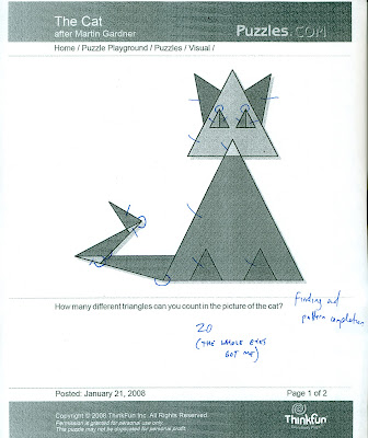
 These final two puzzles involved us in the visual thinking operations of 'finding'. We were to count the total number of triangles. My wife's try is shown here with mine below. The answer is twenty. My wife counted nineteen...


I have to admit that although my try shows twenty, neither of us counted all twenty on the first few tries. For me my visual reasoning messed me up when it came to the eyes. I counted the four seperate triangles but neglected to count the two larger triangles that composed each eye. I guess I was looking so much to find each triangle, I neglected to step back enough to see the completing going on which presented the two extra triangles. I counted 18 for the longest time...

We also both had trouble with the tail. This involved a bit of rotating and completing, because several triangles compose the tail, and to find them all, you need to really activate your visual reasoning.
 
These operations really tested our mental skills.